Spotlight
• About the Project •
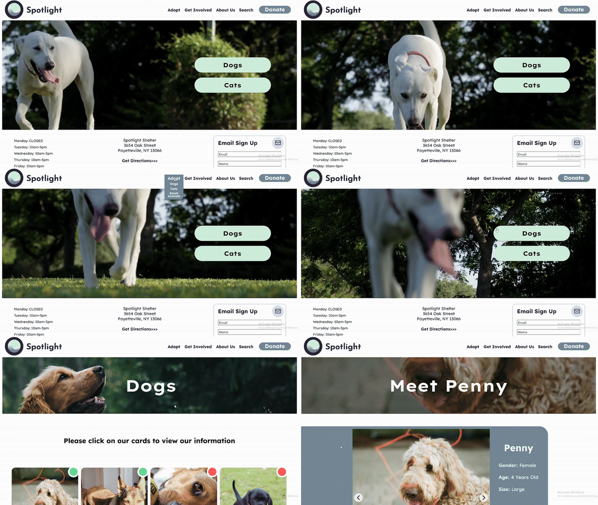
Spotlight was a sprint design created within 35 total hours to help focus on individual weaknesses and to find the ability to overcome them within guidelines and time constraints. Though the application idea is common, utilizing any platform to design, test, and reiterate offers insights into personal growth. This website and mobile integration provided as an exercise that not only tested bounds, but strengthened weaker areas of design.
Rules on Design
To create a challenge, I gave myself a list of rules that I must to follow in order to consider the design a success.
- Design must be within 35 accumulated hours
- Design must provide research, wireframe, usability studies, low and high fidelity prototypes
- Any form of research is considered within the hours of designing.
- Any work to provide insight is considered within the hours of designing.
- Final high fidelity prototype must complete at least one task entirely
- If you go over the alotted time, challenge is considered a failure.
The Start
The first hour of the challenge was dedicated to research. Since there was no design yet, it was necessary to find pros and cons of existing animal shelters. To do this efficiently, I utilized two forms of research: passive and direct. Using a competetive audit on three seperate adoption agencies, I found successes and frustrations within each. While I conducted a competetive audit, I invited volunteers to complete an anonymous survey. By doing both at the same time i was able to supplement documentation on what can be facilitated within the design.
Competetive Audit
Competetive audit was used on the following websites: Takis Shelter, North Shore Animal League, Hi-Tor Animal Shelter, and Dominos Pizza.
Pros
- Simpler format with menus.
- Tight and organized preview cards.
- Preview cards provided temperament of animal.
Cons
- Layout was built with second party plug in.
- Preview cards didnt have enough information for animal.
Initial Design
Roadblocks started the design process. After research, coming up with a design was met with emptiness. A creative block kept the process at a standstill. So, instead of moving in the standard path, I decided to work in areas that would move the process forward. From there, the designs grew.
Usability Studies
After the wireframe was completed, a usability study was conducted. From there, I discovered which pain points the users were experiencing and built along them to improve quality of function.
1
Some of the button options were confusing (back button to take the user to the navigation, search bar). Users found the simple option was to be straight forward in design.
2
Users found the option of scheduling an appointment confusing and unneeded. Users preferred an approach that guided them to a physical meeting without the need of scheduling.
3
Users preferred the use of gender labels next to the name rather than temperament.
High Fidelity Prototypes
Final Time
~29 hours


